In 2019 I wrote up how to build a Piper diagram in R. That post still stands, but the code in it no longer runs. Two of its dependencies have since been removed from CRAN:
- rgdal was retired in October 2023, along with
readOGR. Its replacement is sf. - hydrogeo, which supplied
toPercent, is also gone from CRAN.
The post also sourced a ggplot_Piper.R file from the working directory. That
file is not published here.
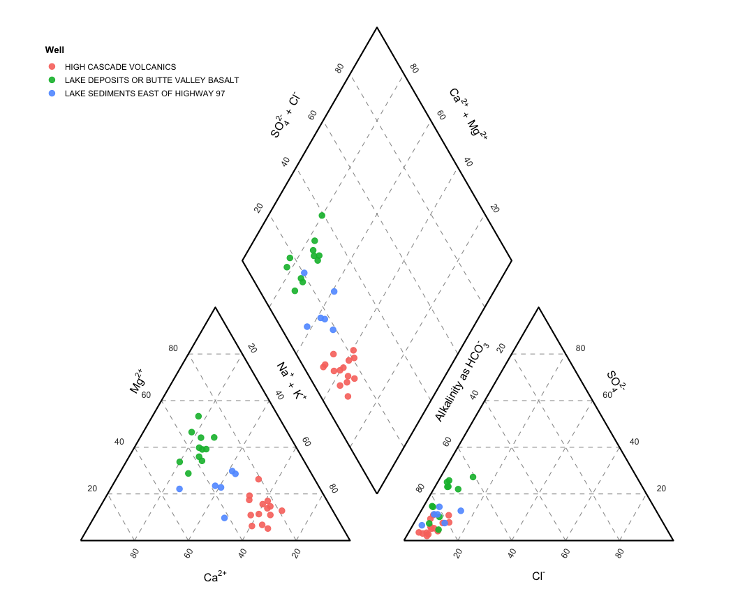
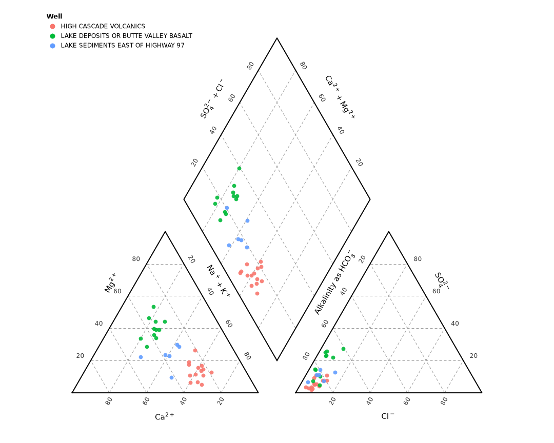
I left the old post as it is and rewrote the figure twice: once in current R using only ggplot2, and once in Python using only pandas and matplotlib. Both produce the same diagram from the same CSV.
The geometry
The layout is fixed. All coordinates are in plot units:
| Element | Vertices |
|---|---|
| Cation ternary | (0,0) (100,0) (50, 86.603) |
| Anion ternary | (120,0) (220,0) (170, 86.603) |
| Diamond | bottom (110, 17.3206), left (60, 103.9236), right (160, 103.9236), top (110, 190.5266) |
The diamond vertices are where the two ternaries’ projection lines intersect.
Those lines run at plus and minus tan(60°). The bottom vertex comes from the
up-slope at (100,0) and the down-slope at (120,0):
y = tan(60°)(x - 100)
y = -tan(60°)(x - 120)
→ x = 110, y = 17.3206
Both files compute the vertices instead of hard-coding them, so changing the 120-unit offset between the ternaries does not break the layout.
R
Full source: piper.R
Converting milliequivalents to percentages. This replaces hydrogeo::toPercent:
piper_percent <- function(df,
                          cations = c("Ca", "Mg", "Na", "K"),
                          anions  = c("Cl", "SO4", "CO3", "HCO3")) {
  stopifnot(all(c(cations, anions) %in% names(df)))
  cat_sum <- rowSums(df[, cations, drop = FALSE])
  an_sum  <- rowSums(df[, anions,  drop = FALSE])
  if (any(cat_sum == 0 | an_sum == 0)) {
    stop("a sample has a zero cation or anion sum; cannot convert to percent")
  }
  df[, cations] <- 100 * df[, cations] / cat_sum
  df[, anions]  <- 100 * df[, anions]  / an_sum
  df
}
Projecting into plot coordinates. The diamond point is the intersection of a line rising from the cation point and one falling from the anion point:
piper_transform <- function(df) {
  cx <- 100 * (1 - (df$Ca / 100) - (df$Mg / 200))
  cy <- df$Mg * GRAD / 2

  ax <- OFFSET + df$Cl + 0.5 * df$SO4
  ay <- df$SO4 * GRAD / 2

  dx <- (GRAD * cx + GRAD * ax + ay - cy) / (2 * GRAD)
  dy <- GRAD * (dx - cx) + cy

  data.frame(cation_x = cx, cation_y = cy,
             anion_x  = ax, anion_y  = ay,
             diamond_x = dx, diamond_y = dy)
}
Drawing it:
source("piper.R")

raw <- read.csv("piper_example.csv")
df  <- piper_percent(raw)
p   <- piper_plot(piper_transform(df),
                  colour = df$Formation, legend_title = "Well")

ggsave("piper-r.png", p, width = 9, height = 7.2, dpi = 120, bg = "white")
Python
Full source: piper.py
The same three steps. to_percent divides each ion by its cation or anion sum:
def to_percent(df, cations=None, anions=None):
    cations = cations or CATIONS
    anions = anions or ANIONS
    missing = [c for c in (*cations, *anions) if c not in df.columns]
    if missing:
        raise KeyError(f"missing columns: {missing}")

    out = df.copy()
    cat_sum = out[cations].sum(axis=1)
    an_sum = out[anions].sum(axis=1)
    if (cat_sum == 0).any() or (an_sum == 0).any():
        raise ValueError("a sample has a zero cation or anion sum")

    out[cations] = 100 * out[cations].div(cat_sum, axis=0)
    out[anions] = 100 * out[anions].div(an_sum, axis=0)
    return out
def transform(df):
    ca, mg, cl, so4 = df["Ca"], df["Mg"], df["Cl"], df["SO4"]

    cx = 100 * (1 - ca / 100 - mg / 200)
    cy = mg * GRAD / 2

    ax_ = OFFSET + cl + 0.5 * so4
    ay = so4 * GRAD / 2

    dx = (GRAD * cx + GRAD * ax_ + ay - cy) / (2 * GRAD)
    dy = GRAD * (dx - cx) + cy

    return pd.DataFrame({"cation_x": cx, "cation_y": cy,
                         "anion_x": ax_, "anion_y": ay,
                         "diamond_x": dx, "diamond_y": dy})
Drawing it:
import pandas as pd
import piper

raw = pd.read_csv("piper_example.csv")
df = piper.to_percent(raw)
fig, ax = piper.plot(piper.transform(df),
                     groups=df["Formation"], legend_title="Well")

fig.savefig("piper-python.png", dpi=120, facecolor="white")
The map
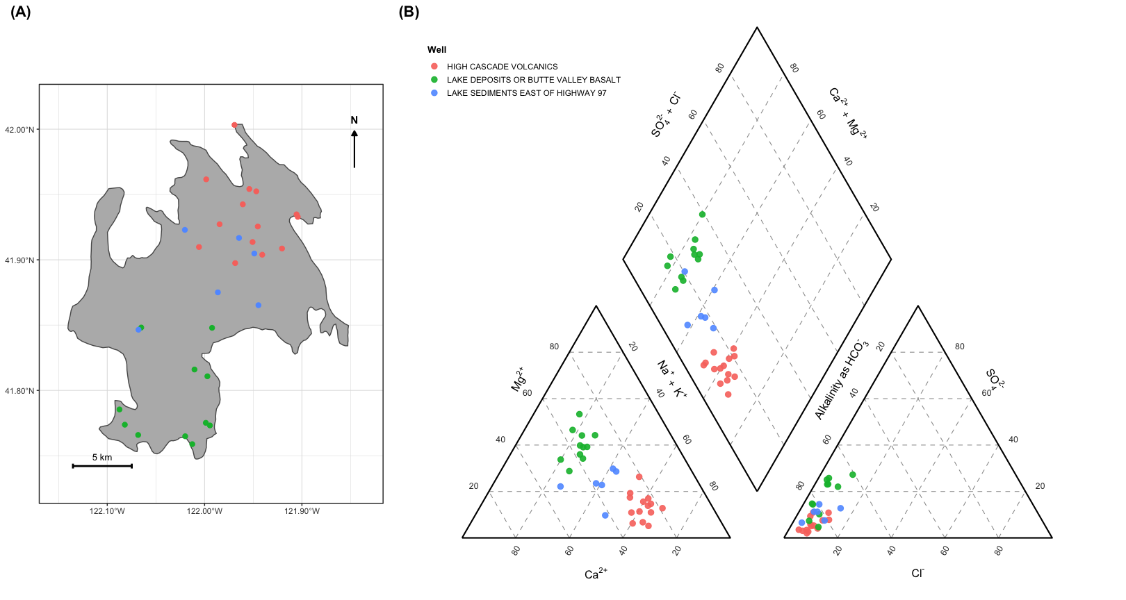
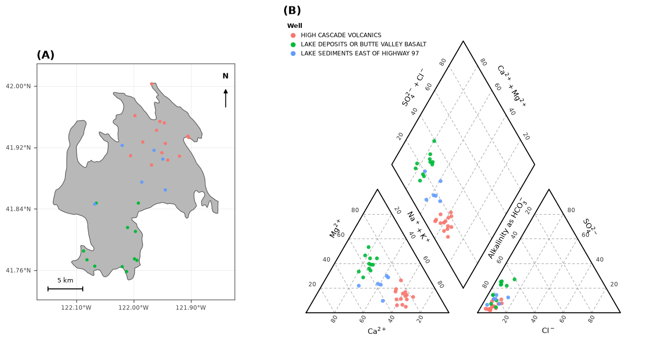
The 2019 map was drawn with theme_void() and no legend, so it showed the basin
outline and the wells but no coordinates, no north arrow and no scale. The
rewrite adds all three.
The boundary is the California DWR Bulletin 118 Butte Valley groundwater basin, number 1-003, 79,739 acres. Reading one polygon does not need GDAL, so both versions parse the GeoJSON directly and avoid a dependency on sf or geopandas.
One degree of longitude is shorter than one degree of latitude, by a factor of
cos(latitude). Fixing the aspect ratio to 1 / cos(lat) keeps distances true
without reprojecting, and the same factor sets the scale bar length:
lat_mid <- mean(range(basin$lat))
aspect  <- 1 / cos(lat_mid * pi / 180)
deg_per_km <- 1000 / (M_PER_DEG_LAT * cos(lat_mid * pi / 180))
At Butte Valley’s mid-latitude of 41.88°N that gives 82,748 m per degree of longitude, so the basin is 23.9 km wide and 28.5 km tall. Computing the polygon area from those factors gives 79,530 acres against the 79,739 DWR reports, a 0.26% difference from treating the basin as flat.
basin <- basin_polygon("butte_valley_basin.geojson")
wells <- read.csv("piper_example.csv")

basin_map(basin, wells, colour = wells$Formation, km = 5)
basin = piper.basin_polygon("butte_valley_basin.geojson")
wells = pd.read_csv("piper_example.csv")

piper.basin_map(basin, wells, groups=wells["Formation"], km=5)
Combined, in the same two-panel layout as the original. R:
Python:
Keeping the two in step
Three things make the outputs match:
- Tick rotation follows the edge. The two outer near-vertical edges, Mg and SO4, read horizontally. Every other edge is rotated onto its own grid family.
- Axis titles sit on each edge’s outward normal, computed rather than placed
by hand. This keeps
Alkalinity as HCO₃⁻off the anion triangle edge. - Python uses the ggplot2 hue palette (
#F8766D,#00BA38,#619CFF), so both figures use the same group colours.
About the example data
piper_example.csv is
synthetic. The Butte Valley water chemistry from the 2019 post is not published
here. The example values are invented to fall in the same regions of the diagram
as the three formations in the original figure, so the code runs without the
original data.
To plot real data, point the same code at a CSV with Ca, Mg, Na, K,
Cl, SO4, CO3 and HCO3 columns in milliequivalents.